Maybe you should paint your studio blue.
A recent study finds the color blue promotes creative thought while the color red helps emphasise detail. Given the same question of how many uses they could come up with for a brick, testers answered with practical answers when the question was displayed on a red background. 'Build a house' for example. Asked the same question but with a blue background, testers responded with more creative plans for the brick. "Make a paperweight or build a cat scratching post' type ideas.
From what I read, we associate red with caution, precision, and danger. Red traffic lights, red teacher marks, red alert lights. Previous studies found sports teams wearing red won more games and seemed more intimidating. (Is this why the Texas Rangers have added a new red uniform to this season's selections? Is it a coincidence that the team was a powerhouse in the late ninties when their uniforms were red?)
Red increases precision and attention to detail...great for proofreading, don't you think?
Blue, on the other hand, makes us think relaxing thoughts. Sunny skies, calm seas. Freedom. Happiness.
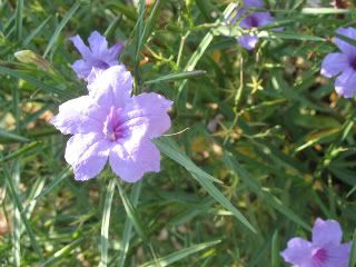
Naturally, the study of color's effect on creativity is still in the baby stages. More will come. It is still my personal belief that colors which make you happy are the colors an artist needs to surround him or herself with. For me, that remains yellows, greens, and purples. Interesting though, that purple is a combination of both red and blue.
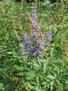
In the meantime, can it hurt to add some lush blue accents to your creative space? Even something small to rest your eyes on can prove diverting. A piece of art. A book whose cover is predominately blue. A rich blue fabric. A pot of blue flowers. Try it and see if you think it makes a difference. I'd like to hear what you think.


1 Other Creative Souls are Saying:
This was very interesting, Deb. Out of sheer laziness about not wanting to dismantle my bookcases, I have not painted the cave. IT is a nasty lavender. Well, for your sake, I'll change that. It is lavender. That's not MY favorite color, but it's not nasty. It just doesn't inspire me. However, while I am in there creating something new, I look at one of two things -- out the window at the sky and the green trees (when they are green) is one thing I look at. The other is a Cheyenne Indian Wheel of Life. Looking at the center of it reminds me to write from my core -- however, after reading your post here, I took a look at the painting in the center of the wheel of life, and it is sky blue. A double whammy! Then, I can't tell you how often, when I'm trying to edit or restructure, analyze or deconstruct something I've written, I end up doing my best work in my kitchen -- which is decorated in deep red apples. I find that I am most drawn to the color blue first, then red, followed by yellow and green.
What Other Creative Souls Are Saying